- Dates6 March 2009 - 2 May 2009
- Artists
by Rudi H. Fuchs
I notice that everything in this work slightly staggers and reels, as if the small, fragile paintings actually refuse to be there. Somewhat excited, they whisper. The studio in Antwerp where I recently looked at them, was not so much in disarray — rather, it was filled with strangely constructed things. I don’t have another word for it. There were also lots of sheets of paper with ideas and trouvailles of all kinds. It’s easy for paintings to hide in this surroundings — i.e. to withdraw in the shrewd ambiguity of their own design. In this surroundings of mysterious contraptions (i.e. the studio) some paintings were present, which, after some coquettish wavering, might (probably) be finished the artist conceded.
Had this status resulted in clarity? I glanced at a painting which dated from a few years earlier, Entrelacs, but which for some reason had remained in the studio. To start with, it is a painting on a sheet of metal and consists of two unequal parts. But I don’t want to go into this aspect right now. Visiting Swennen’s workshop, I noticed that in his art there is little coincidence and that he is inclined to incorporate all kinds of physical peculiarities into the manufacture of the painting. But for now, I would like to find out first how Entrelacs has come to look the way it does. I want to attempt to understand its genesis; thus, I might be able to say something about how the artist proceeds. I presume that in this instance the immediate cause of the work has to do with the thin pale grey of the metal. As the title already suggests, the artist has moved his brush vertically a number of times, up and down, with slow sliding movements, applying three colours: white, pale blue and red. The curls and loops are the result of different articulations and rhythms; they intertwine on the surface — but not too closely. The intertwined structure has remained transparent. The nimble progress of the single line is easy to follow — it is a mystery our glance cannot detach itself from. (Think of the full texture of the music of a string trio: we still attempt to discern the melodic line of each instrument separately, because we enjoy doing so.) I look at the painting, which according to the painter is finished, and yet does not turn silent. I noticed that the precarious balance between definition and suggestion is typical of Swennen’s work.
But let us return to the colour of the metal. It is a matt silvery grey and in some areas there are horizontally oriented grazes that reveal a slightly darker grey. When the artist noticed it — objet trouvé — it may therefore have radiated a vague atmospheric effect. It may have had an appeal also Ensor sensed as he watched the slowly heaving sea under a grey, hazy sky, listening to the dull sound of the waves. In this veil of shades of mostly amorphous grey, the artist then (so I imagine) descried the lofty, groping brushstrokes that may result in beautiful marines. Likewise, I can imagine that it was the thinness of the metal grey that caused Swennen to use these conspicuously rare shades of white, red and blue — gliding colours that are matched by the brushstrokes and the airy manufacture of Entrelacs. I could have asked the painter, of course, but then, wouldn’t I have deprived myself of the pleasure of discovering the painting? In my experience, this discovering is an itinerary that is like a journey without end but also without orientation. It is a hovering between observations and memories. The particular colour scheme blue, white and silvery grey e.g. makes me think of certain elegant combinations of pale blue and silver in the ornaments of Bavarian rococo, which are so typically different, more reserved than the usual combination of red and gold in the decorative arts. These are the things I am thinking of while I look at the painting, slowly, irreversibly slipping into its world. Everybody who consciously looks at a painting, will lapse into this sort of musings. I can easily think of a dozen more rovings, which all become part of this unique atmosphere of the painting. Entrelacs is an unfathomable space, a sort of magic caught in two dimensions, in which movements and colours entangle and mysteriously keep the motion going. This painting never, nowhere, results in a mute, austere definition of design. I presume that qualifies Swennen’s work in general.
In a way, this conclusion, too, is ambiguous: even a painting by Mondrian is probably less definite that the austere rectangular shapes would have us believe. A work by Mondrian, too, like all good art, is surrounded by web of suggestive relationships. Yet, there’s a certain difference. Mondrian undisputably had at least the intention to create a design that was supposed to achieve the optimum degree of orderliness. Therefore, all sorts of things (systematically) had to disappear from the artist’s repertoire: curved lines, diagonals, warm shades of colour and all these other things that could result in confusion and weaken the impression of discretion and method. In Swennen’s work, however, I think confusion plays a productive part. In Entrelacs e.g. static and defects seek to entangle. This results in this overall impression of uncertain, wavering, suggestive shapes. This effect is also due, I notice, to the deliberate composition with two unequal parts, consisting of thin, grazed, slightly dented plates of metal. And then, like a fata morgana, an almost weightless shape appears (as rare as the pale sun over Ensor’s sea), a shape which pleases me tremendously, all the more so in these uncertain times.
Excerpt from How to paint a horse, 2008
by Quinn Latimer, Frieze
‘I never saw an ugly thing in my life,’ John Constable once opined. Two hundred years later, his rather romantic claim found its way into a sketchbook of Belgian painter Walter Swennen, scrawled in red, uppercase letters. Tellingly, the line could apply as much to Constable’s genteel, dappled landscapes as to Swennen’s more shambling works, though the wit of its application is perhaps more pronounced when considering the latter, which often feature vaguely cartoonish visual motifs on messily abstract grounds. Born in Brussels in 1946 and now based in Antwerp, Swennen first came to prominence in the ’80s in Belgium, and his paintings still carry traces of that decade’s flamboyant laconicism. Unlike other European painters of the period who found fame in the US, Swennen never quite broke out. This is odd, considering that his untailored style of neo-expressionism seems closer to the New York artists of that time than that to their European counterparts. Nevertheless, a recent string of shows – including one now on at Nicolas Krupp in Basel – has brought his oddly current oeuvre back into the light.
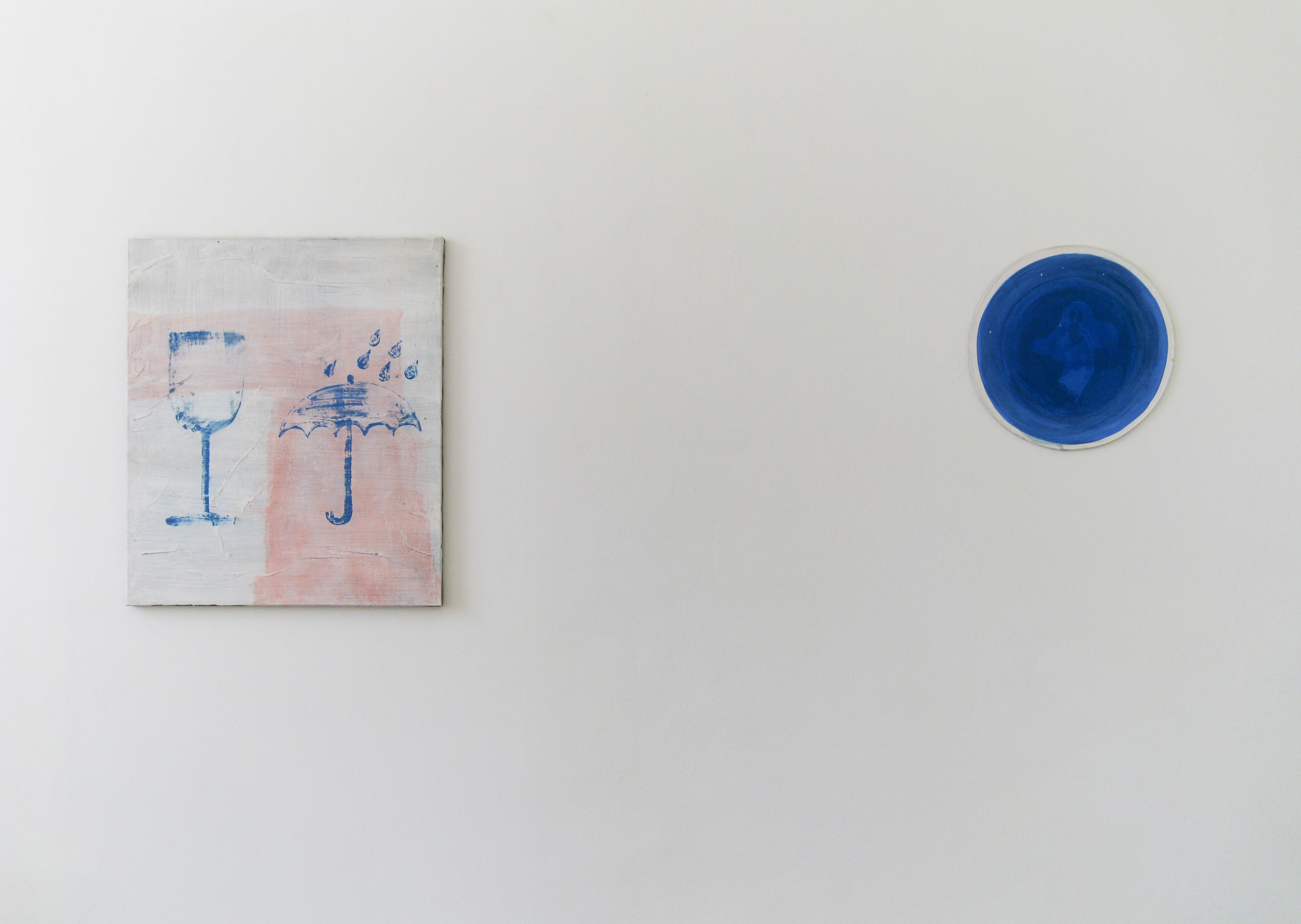
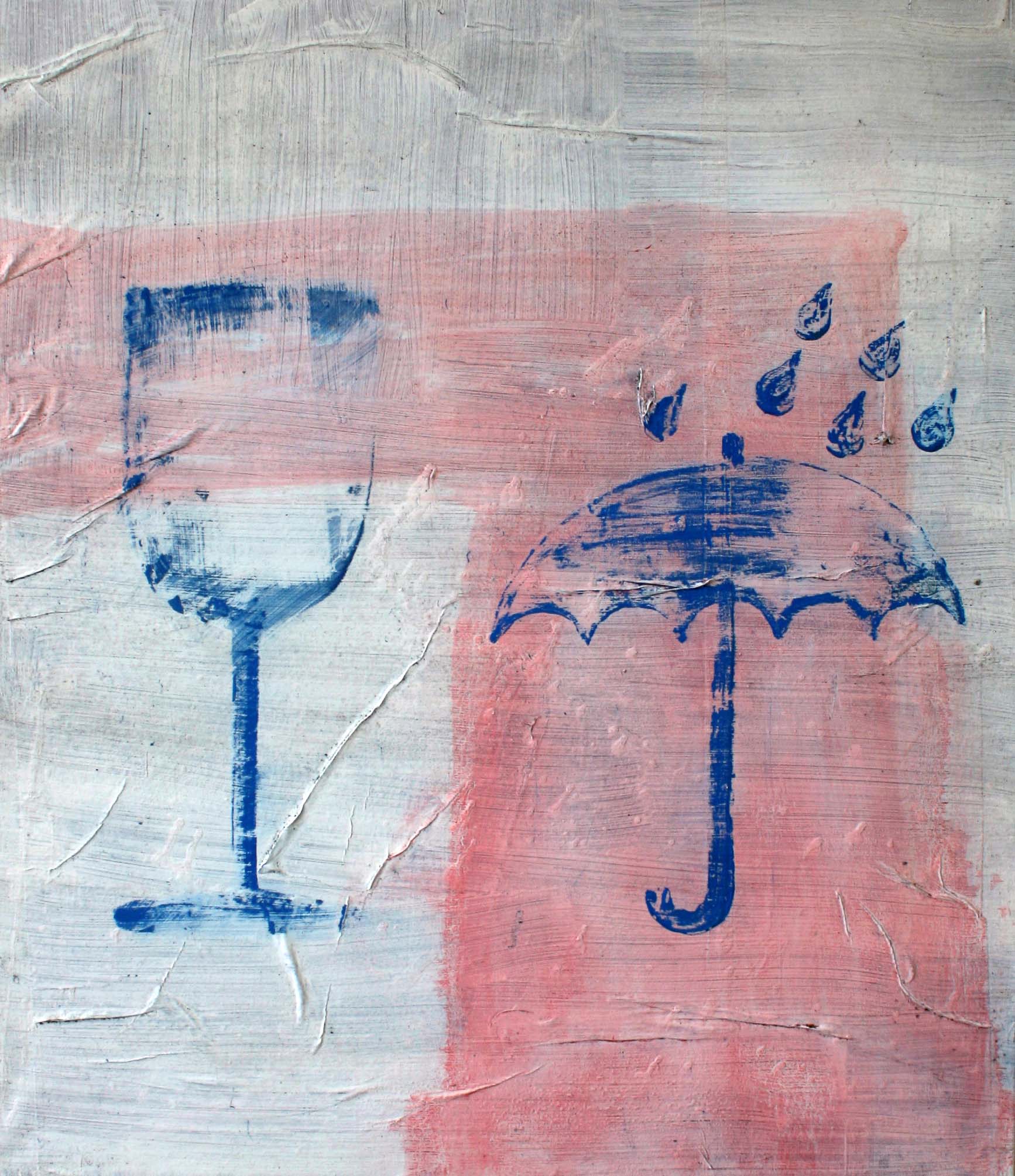
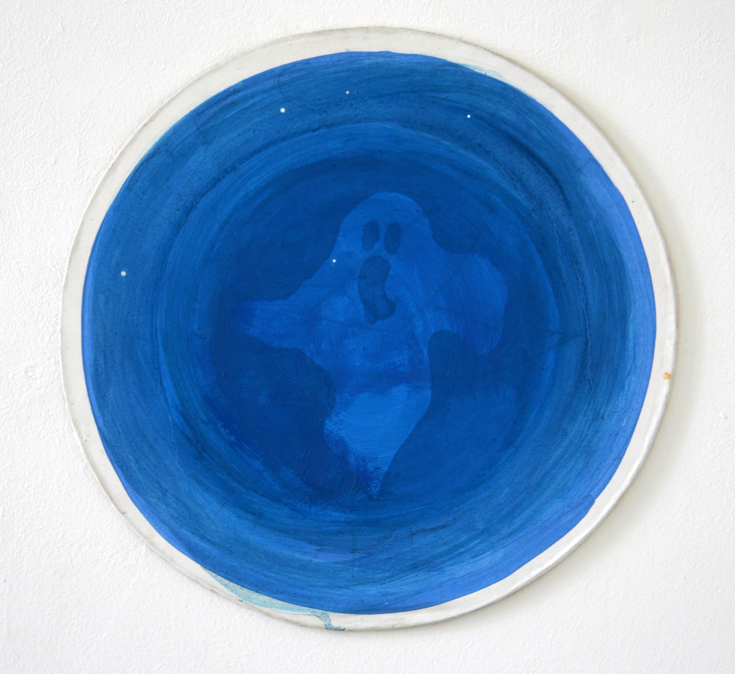
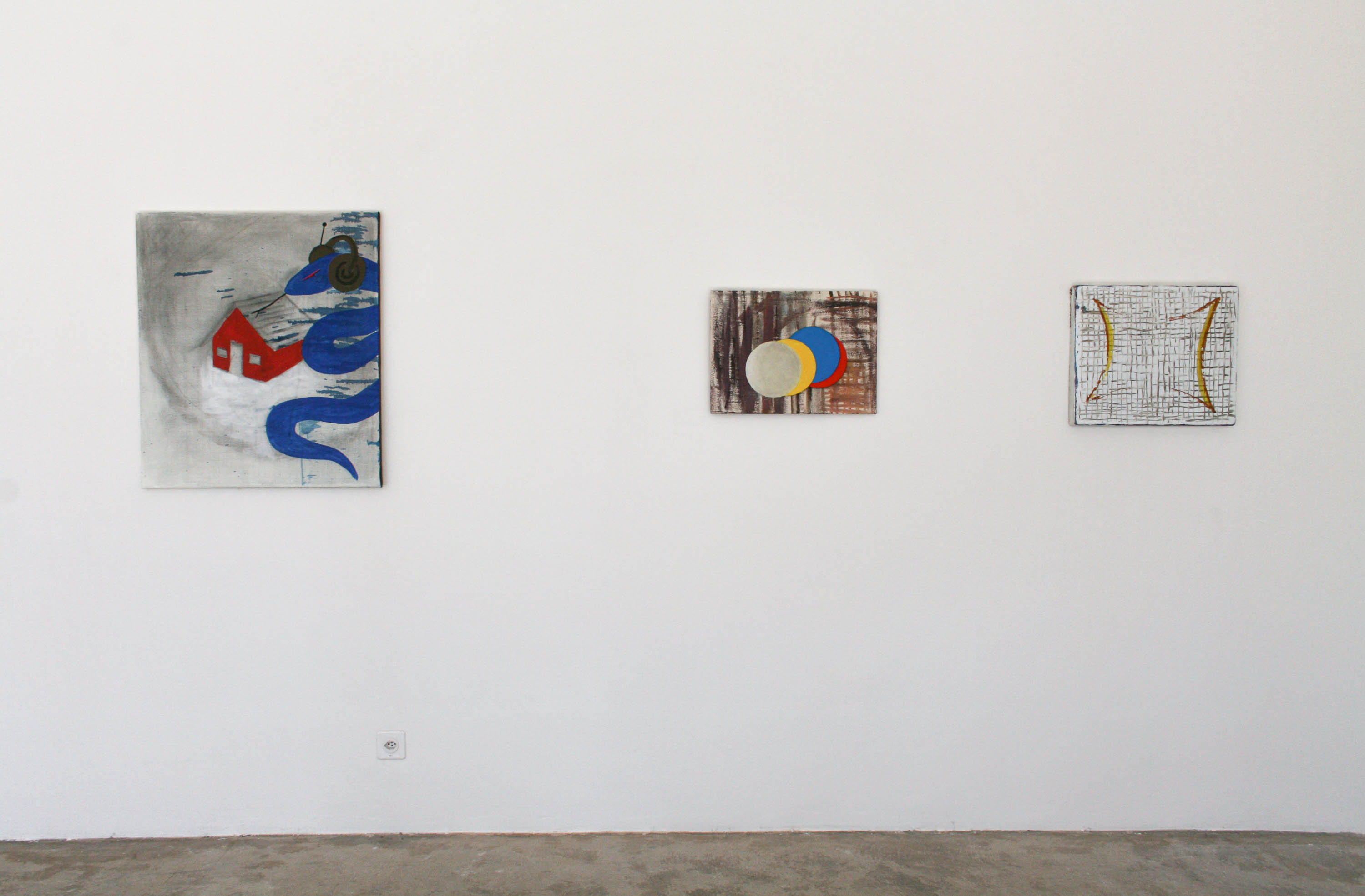
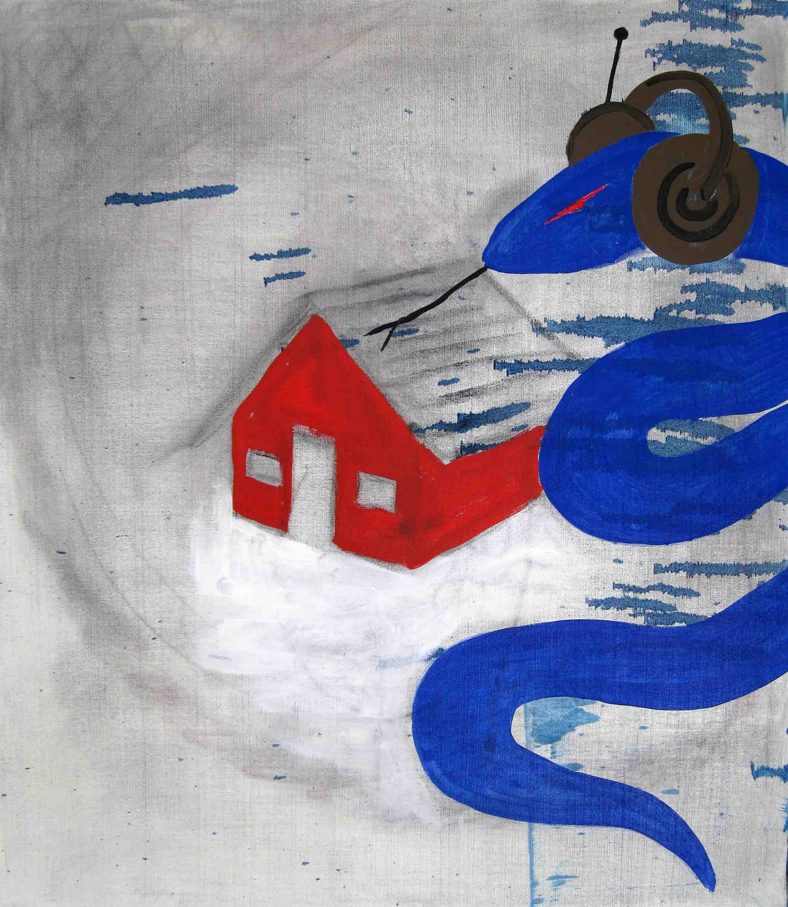
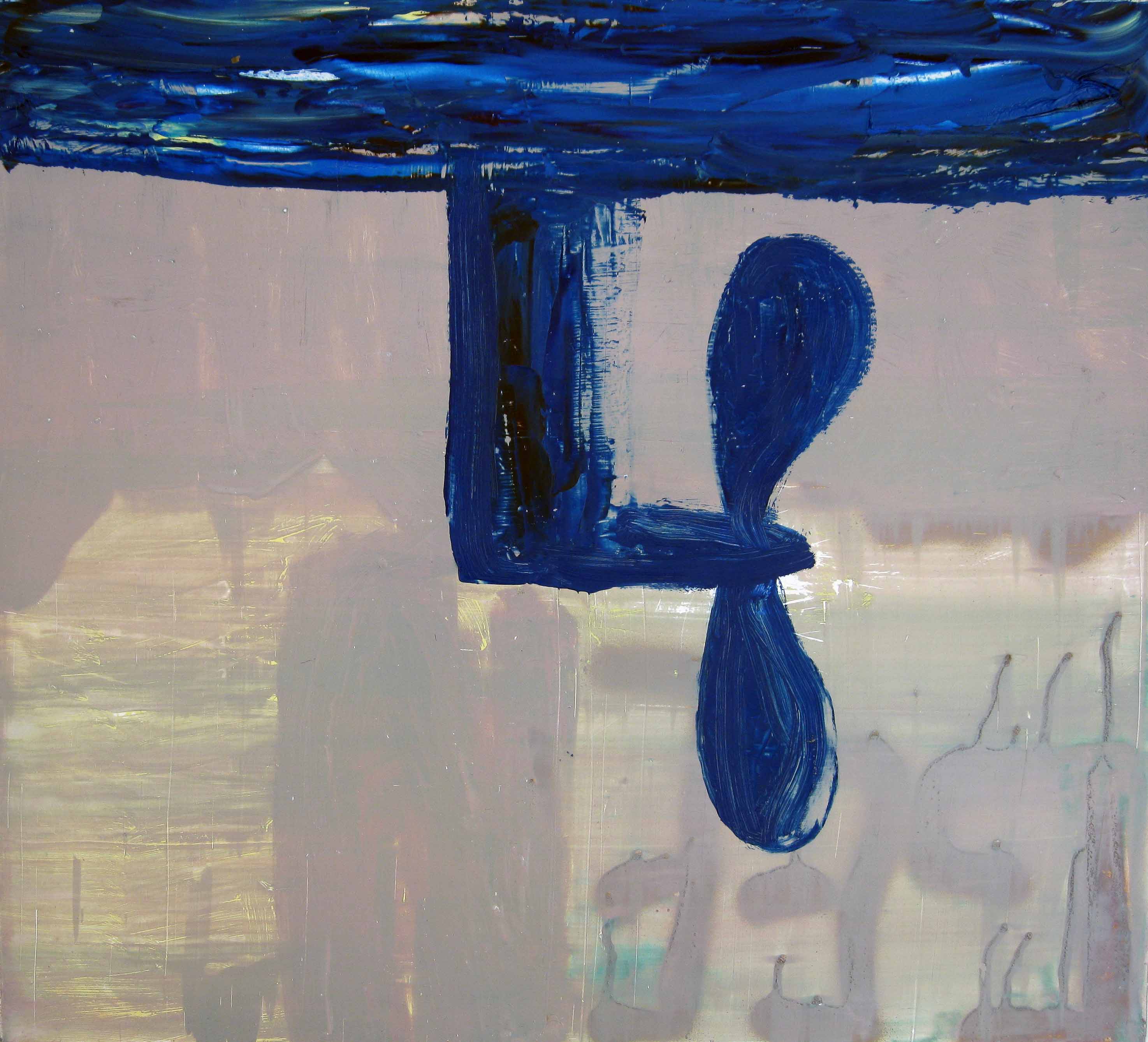
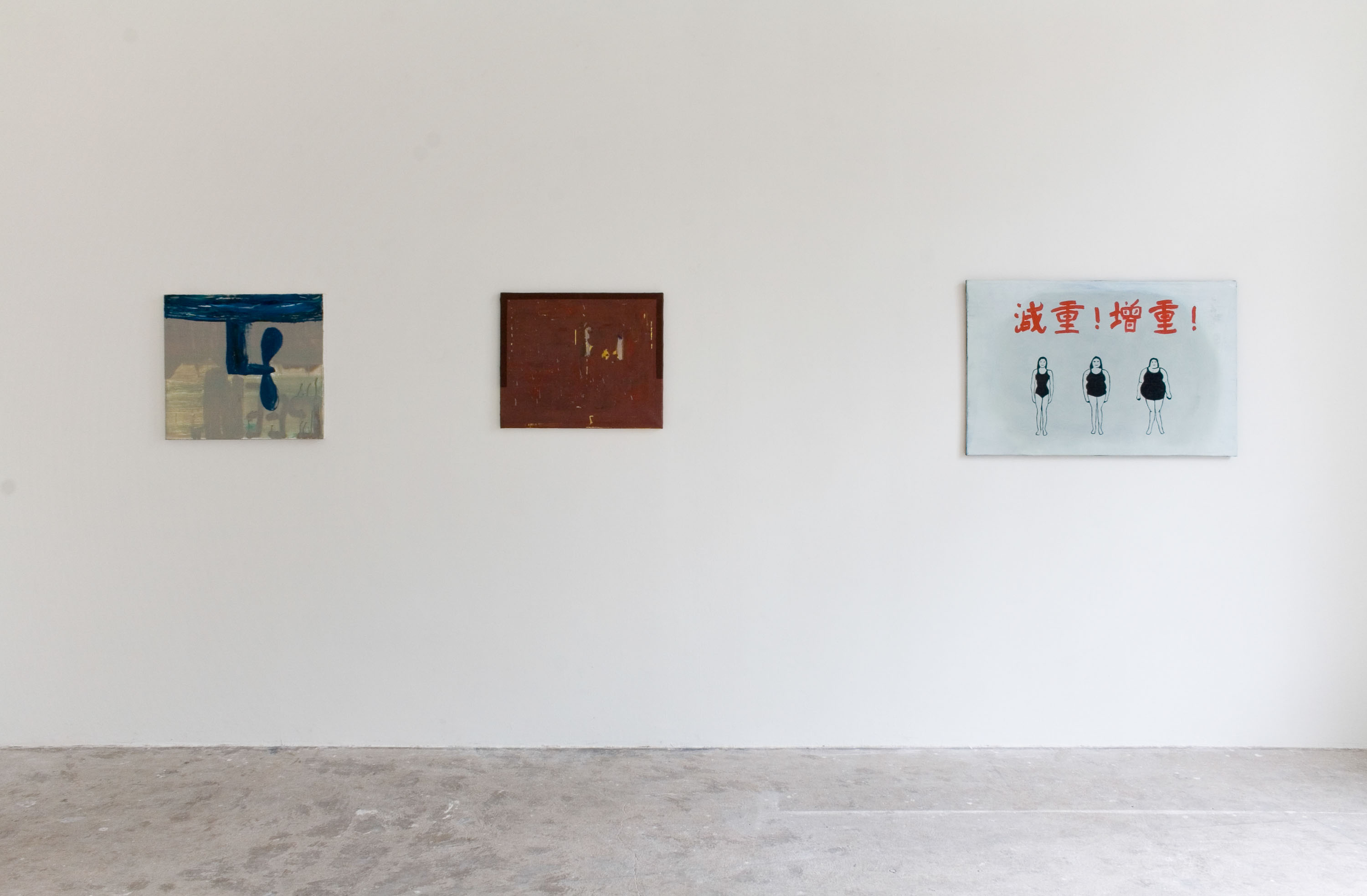
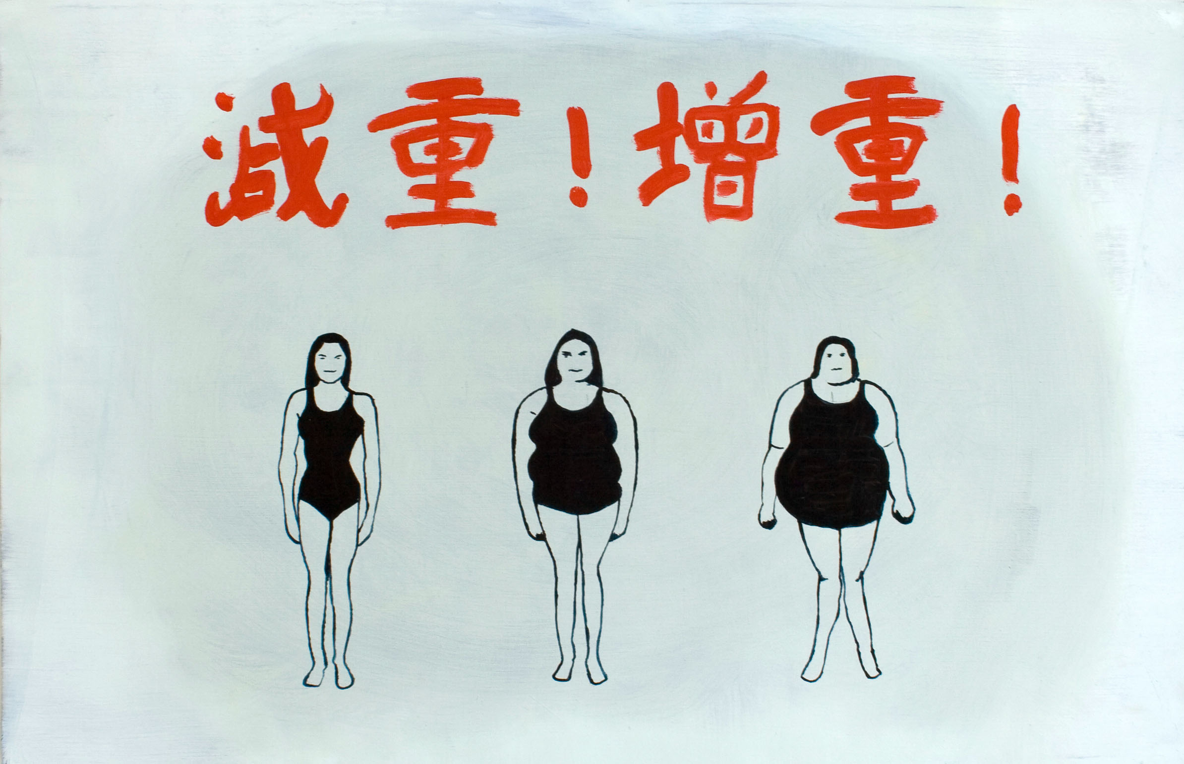
The paintings at Krupp, all from the past five years, immediately establish their maker as a kind of studious slacker. Swennen’s sketchy, improvisatory technique often begins with a vaguely familiar visual motif, such as a bulbous aeroplane, a bluish wine glass, a cartoonish ghost. He then employs this image like a melody, letting it float loosely atop a ground made of more allusive elements, including spectre-like blocks of colour, dripping and scratched paint, or rough terrain that seems to have been baked in the sun. Verre et parapluie (2007) places a wine glass and an umbrella – each featuring blue, willowy stems – on top of a pale ground crossed by a geometric length of faded pink, like a red carpet stretching off into the distance. In Hélice (2009), a blue propeller hovers from the top of the painting over a hazy violet field that seems to indicate a vague crop of buildings. The oil painting – made on metal, as are several of the works in the show – seems like nothing so much as a single frame plucked from a larger cartoon, its larger narrative lost forever. In Chalet (2009), a blue serpent wearing big ’80s headphones looms over a simple red house, its split tongue flickering toward the roof. Both beings, the snake and the home, seemed suspended in a kind of pale, dreamy space – there is no real ground, or grounding, in sight.
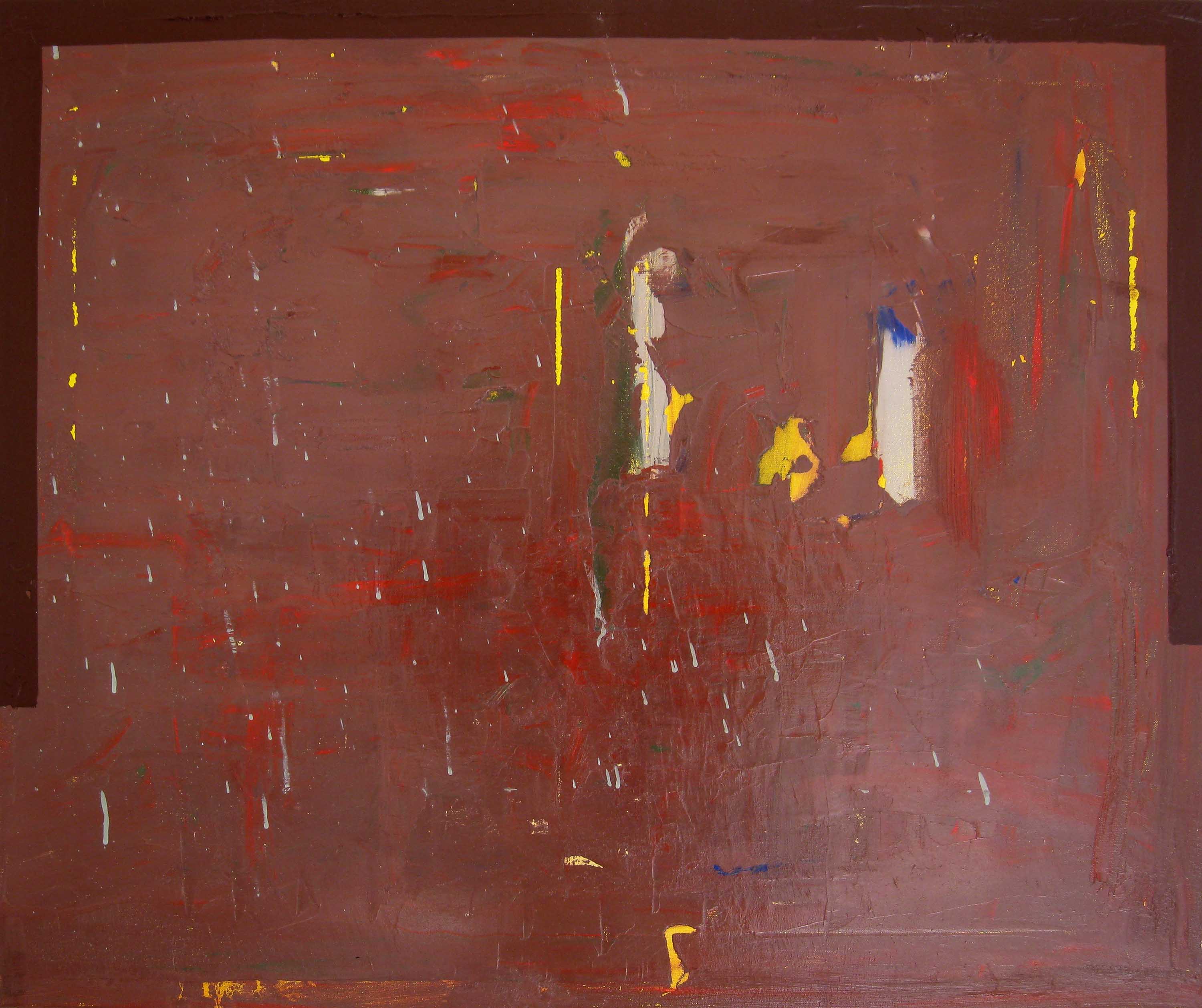
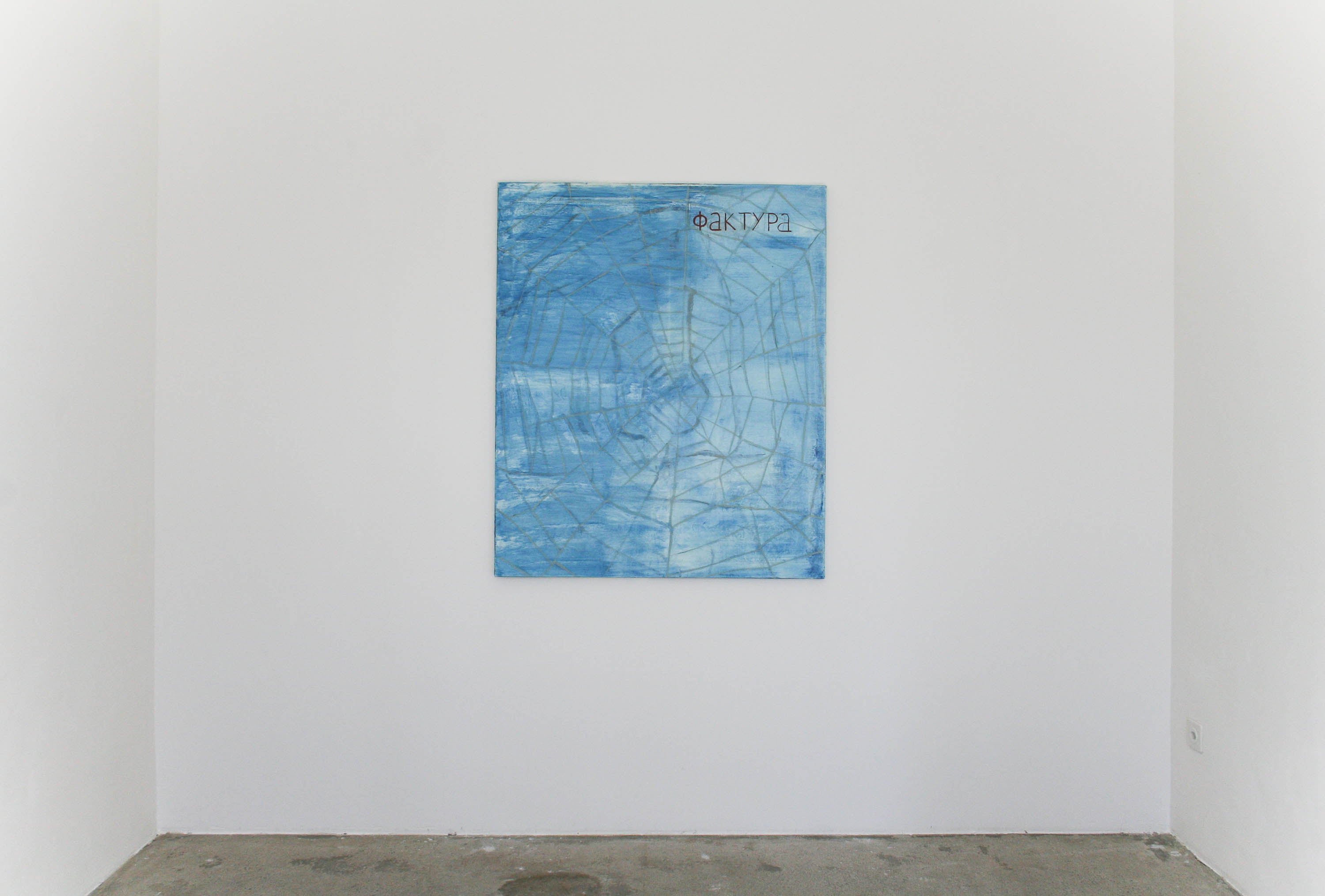
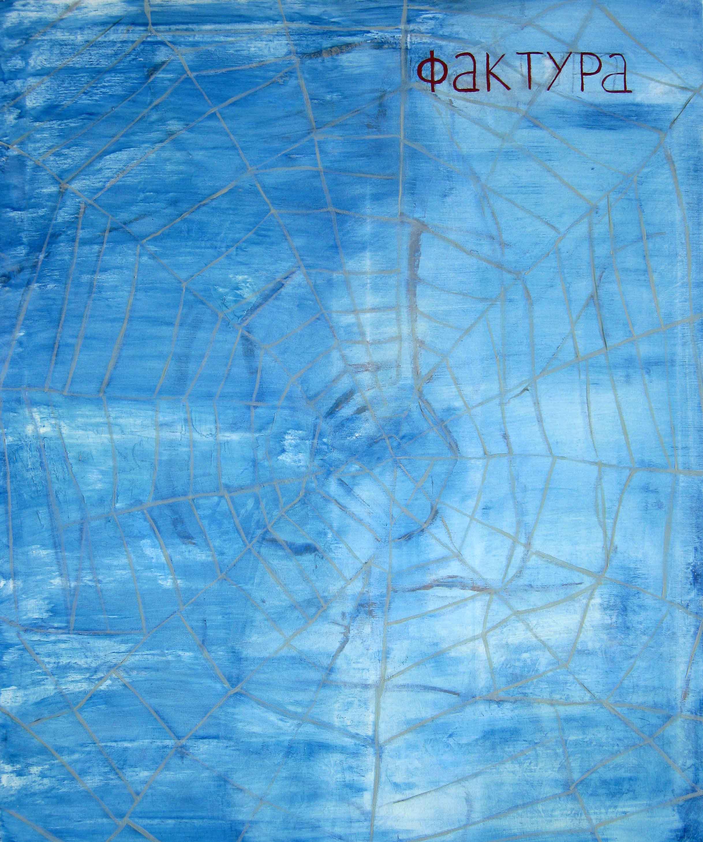
In other works, Swennen dispenses with figurative iconography; ground becomes all. Without any narrative signifiers, one becomes weirdly attuned to the paintings’ formal qualities: colour, line, surface, perspective. Surface in particular seems key: an untitled work from this year features thick, clotted paint in pale tones, with only a loosely architectural pattern appearing in one corner. Another untitled painting, this from 2008, has a creamy veneer with rainbow undertones that evokes a brick wall if it were made of yoghurt. One of the best works in the exhibition is also the largest, an Aegean blue painting over which is laid a kind of web or net, the Greek letters of its title painted in the top right-hand corner. With its aerial view of watery, cerulean hues, it oddly recalls a minimal ’70s-era travel poster for some island destination.
Nevertheless, each reference I alit upon eventually seemed forced. Taken together, the works are inconclusive, their overall sensibility defined by a sly, seemingly defiant indefinition. Yet, despite being so aloof, these paintings – both wry and inscrutable – are oddly personable. Their mucked-up surfaces, blasé palette and jazzy visual vocabulary have a sweet jocularity despite the grubbiness. Perhaps it’s this sensibility that leads us back to Constable’s earnest assertion that he’s never come across an ugly thing, not in his whole life. Easy as it is to find comedy in that statement, it could also hold true for Swennen, even though his oeuvre proves that he’s no faint-hearted aesthete who has little regard for the hierarchy of aesthetic subjects. Instead, the world of the cast-off and the incomplete is invited in and asked to take a seat, wherever and whatever that may be.
02 April 2009
Walter Swennen
Brussels-based artist Walter Swennen (1946 - 2025) is active as poet and painter, and the dynamic between word and image is often featured prominently in his work. Swennen paints or draws with playful irony and a special talent for visual associations. Swennen calls himself a constrained artist, but he claims to actually use these constraints to paint. Central to Swennen's work is for the viewer to leave behind reason and give leeway to imagination.